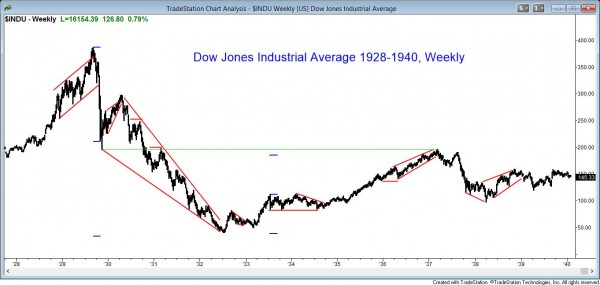
Charts are the same as 100 years ago

Now that computers dominate trading and markets are international, a common topic is whether the behavior of markets has changed. The movement on charts is called price action and it is a reflection of human behavior. Like all behavior, it is genetically based. People have always wanted to make money and we all do it by trading all day long. For example, when you go to the store, you trade money to get an apple.
I have looked at charts going back 100 years and I have traded since 1987. If I remove the labels from the charts, I cannot tell if the chart is from 1910 or 2010, and I cannot tell if the chart is a 5 minute Forex chart or a monthly chart of the Dow Jones Industrial Average.
Computers have not changed price action
How can computers not have affected the price action? It clearly has some effect, but I believe that algorithms simply look for logical patterns and then structure trades where there is a mathematical edge. That is exactly what all traders have done in all markets since the beginning of time.
Trading is genetically based
Trading has always been part of civilization and crucial to survival. This means that the more fit traders have an advantage and that their genes have been naturally selected over those of incompetent traders for tens of thousands of years.
The result is that trading is genetically based, and computers simply move trading closer to perfection. This is why the charts are the same as they were 100 years ago and why the charts of all markets and all time frames look the same and always will.
All price action is genetically based, even if the trading is done by computer. A very experienced price action trader can understand what the market is doing during every tick during the day.

Charts are the same in all markets and time frames
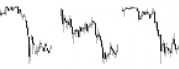
For example, look at the three charts below. I hid the time and price axes to illustrate this point. Can you tell which is a gold futures chart, a EURUSD Forex foreign exchange chart, and a chart of GE? Also, which is a daily chart during the 1987 stock market crash, a 1 minute chart, and a 5 minute chart?

All time frames have the same price action
Many traders cannot watch the market all day long and instead trade using 60 minute or daily charts. Although most of the examples in my course involve 5 minute charts, there are many that use daily, weekly, and monthly charts as well.
For example, look at Module 43, which I have posted on the site in its entirety for free. There is a detailed example of how to trade a price action trade in the weekly Forex foreign exchange market.
Price action traders believe that markets are fractal. This means that bigger patterns are composed of a collection of smaller patterns, and no matter how tiny a chart you examine, you will still see the same patterns that you see on monthly charts.
If you look a chart like the ones above where there is no price axis on the right and no time axis below, you would not be able to tell if it was a 5 minute, 60 minute, daily, weekly, or monthly chart, or a chart made of 1,000 ticks or 50,000 shares. Why is that? Because charts simply represent human behavior, which is genetically based, and a higher time frame chart is just a bigger collection of behavior.
Trade all markets and time frames the same
Most price action traders trade all charts the same way (obviously adjusting position size, risk, and reward, based on their usual maximum risk for any trade), and you probably will as well after you learn how to trade.
You see this on television all the time. An expert will show daily, weekly, and monthly charts and use the same words to describe them. He looks for trends, trading ranges, support, and resistance, and does not care what the time frame is.
When I trade the 60 minute chart or a daily chart, I use the exact same analysis that I use on a 5 minute chart. However, when I hold trades for days to weeks at a time, it is usually in the form of options because I want to contain my risk.
High frequency trading are not a problem
With High Frequency Trading firms getting so much press because some are incredibly profitable, there is a tendency among traders to move toward smaller and smaller time frame charts. I have noticed that there are several people promoting these charts as a way for traders to make money.
I strongly believe that most traders will only lose and never win long-term if they use very small time frames. I address the reasons in the course, but the most fundamental one is that these charts do not give traders enough time to think clearly and they end up making too many mistakes. A 5 minute chart is a good place to start, and I recommend avoiding any chart where there are more than 20 bars per hour.
Seasonal tendencies
There are some seasonal tendencies that can be shown statistically. I sometimes bring them up in the trading room at the appropriate time of the year.
For example, during January, there is a tradition on Wall St. to find significance in what happens early in the year. Traders like to think of January as a barometer and look for statistics about whether the new year will be an up or down year based on what happens in January. Although the statistics are valid, they do not help in structuring trades.
My list of January observations
- On average, every year has a 67% chance of closing above where it opened and only 33% chance of being down.
- If the 1st 5 days of January are up, January is up 76% of the time. However, all months are up 65% of the time, so this is only a small improvement. If it has a head start, it makes sense that the odds for the entire year being up are better.
- If the first 5 days are negative, Jan is down 60% of the time, instead of only 35%.
- If January is up, the year is up 82% of the time, and the average gain from February to December is 8.5%. This makes sense since the year has a 67% of being up anyway, and this is another example of a head start increasing the odds for the entire year.
- If January is down, the average gain from February to December is only 1.7%, and the year has a 58% chance of being down, instead of the usual 33%.
Other calendar tendencies
“Sell in May and go away” is an adage that is still reliable. The stock market makes most of its gains from October through April.
There is tendency to get a rally at the 4th of July, which might be more due to the end of the 2nd quarter. The period between June 26 and July 6 has a rally 75% of the time, and the best is June 30 to July 5.
September is weakest month for bonds and S&P. However, on average, it is only 1% worse than other months, and that 1% can come in a single day. That means that most of the days are like those during the res of the year.
The market tends to rally around Labor day, especially from August 30 to September 5.
October and the 4th quarter
October sometimes has big down moves like in 1929 and 1987. However, it usually closes strong, even if there is a sharp selloff. The close on November 5 is above the close of October 26 about 95% of the time.
This is in part because it is the end of the year for mutual funds and the funds buy stocks to make their portfolios look good. This is called window dressing. Fund managers want to make sure that the quarterly reports show that the funds owned all of the best stocks at the end of the quarter.
This gives them plausible deniability so that when someone criticizes their bad performance, they can claim that they had the right stocks, but random fluctuations created their bad performance.
The adage “Thanksgiving is owned by the bears and Christmas by the bulls” is not reliable at all.
In election years, even only congressional elections, most of the gains occur in the final 12 weeks, starting in mid-September, and most of the year is usually a trading range.
Dogs of the Dow
The Dogs of the Dow theory says that traders should buy last year’s Dow stocks with the highest dividends. This is a value trade. Traders are betting that the worst Dow 30 stocks will catch up to the great performers this year. This is not reliable, and you get what you pay for. If you are paying little, buying a beaten down stock, you are getting little.
Thank you for reading my How To Trade Price Action manual.
The next article is The folly of trading fundamentals.
Complete list of links for all How to Trade Price Action Manual chapters.